Using Flutter Themes for Cross-platform Landing Page (Web-Hummingbird, Android, iOS)
Posted on June 27, 2019 in Flutter
Background
This article is in continuation of Making Cross-platform Flutter Landing Page Responsive. In previous post, we learned how to make a cross-platform (Web, Android and iOS) landing page responsive for various form-factors. In this post, we'll see how can we change look and feel or theme of the landing page quickly, just by modifying small piece of code.
Checkout the companion video:
Part-1. (Themes Introduction):
Part-1a. (Global Theme):
Part-2. (Local Theme):
Part-3. (Custom Fonts-Web):
Part-3a. (Custom Fonts-Native Demo):
Goal: Our goal is to create themes for Cross-platform Flutter landing page (Web and Native apps).
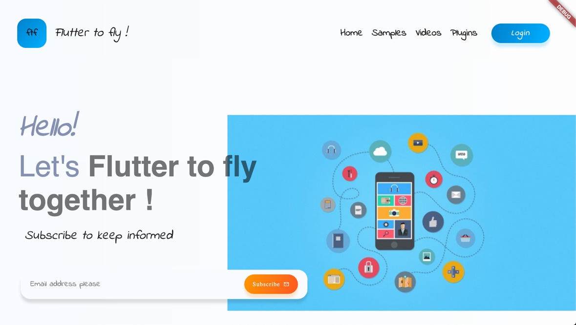
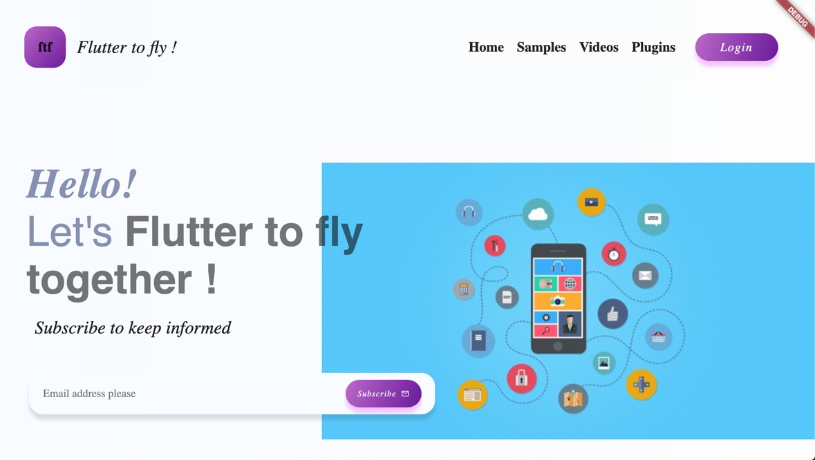
Theme#1: BlueTheme Uses custom font Indie Flower and blue color for header section. "Subscribe" button demonstrates local widget theming.
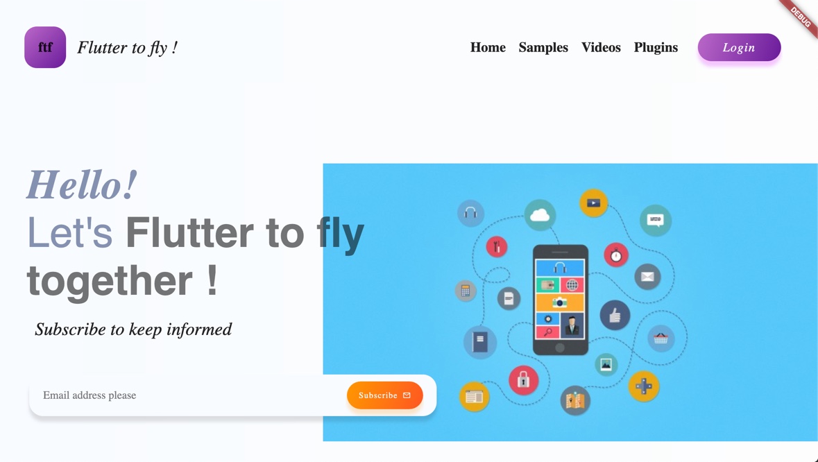
Theme#2: PurpleTheme Uses purple color for header section. No default font or text styling specified. "Subscribe" button demonstrates local widget theming.
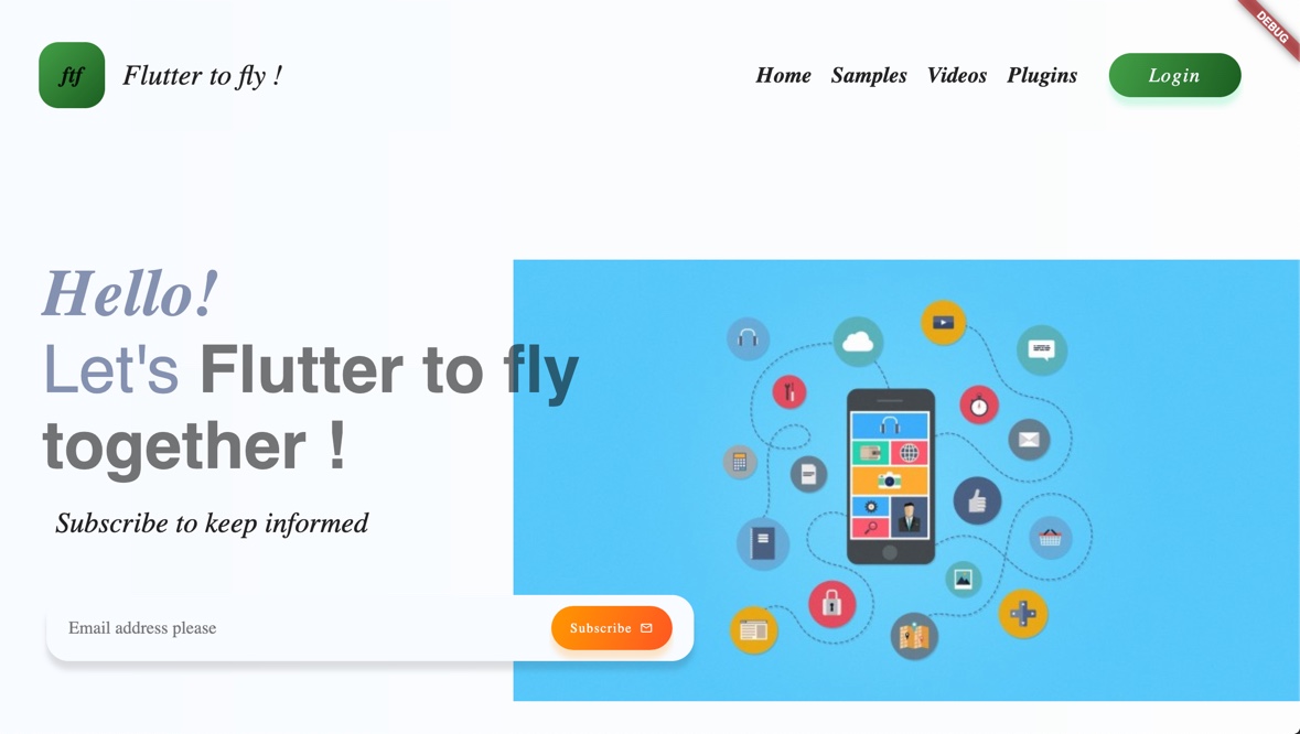
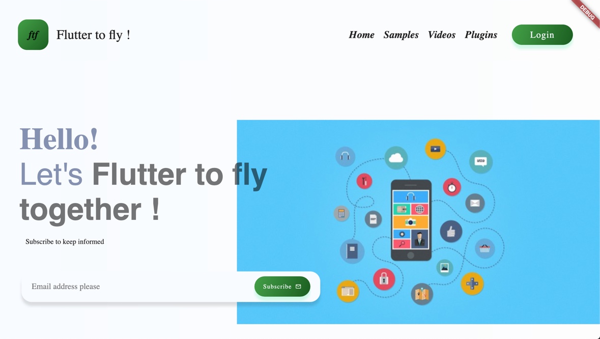
Theme#3: GreenTheme Uses green color for header section. No default font specified. Header navigational links are styled italic. "Subscribe" button demonstrates local widget theming.
Introduction
This article is third in Designing Cross platform Flutter prototype for Landing Page series. In this article, I'll show you how to create and use Flutter Themes for landing page.
Two ways to implement Themes in Flutter:
-
Global Theme: This type of theme affects whole app. Global themes are implemented using
ThemeData -
Local Themes: This is responsible for making changes to one part of the app rather touching any other part of the app. Local themes are implemented using
Themewidget and passing specificThemeDatainstance to it.
Let's get started by defining global theme say AppThemeBlue for our landing page. Later on, I'll show you how a particular widget's (say SubscribeButton) theming could be changed using Theme widget.
This article covers three aspects of Flutter Themes:
- Part #1: How to create and use Global App themes
- Part #2: How to create and use local themes for a widget
- Part #3: How to use Custom Fonts in themes
Part #1: How to create and use Global App themes
I've created a utility class MyAppThemes to keep track of my all themes related configurations. All methods in this class are static. I'll be using three theme colors: Blue (default), Green and Purple to demonstrate different themes. I've created another utility class MyColors to keep all colors in one place. This gives me flexibility to change shades of any particular color to a desired one at one place rather hunting for each and every occurrence in whole code base.
Defining App's global theme: We need to customize ThemeData's attributes to achieve our desired appearance of the app. I've used different hues of blue for primaryColor, secondaryHeaderColor and accentColor. I'll be referring to one or another of these colors from my app's widgets later from the code base.
Note: I'm using pre-defined colors in MyColors class that I've named as color name prefixed with a number like blue1, blue2 and so on for all colors that I've used in my web/native app.
This is how a basic theme in blue would look like (all colors are used as different shades of blue).
Note: In this article, I'll be implementing lighter theme only. You can read more about brightness attribute here.
static ThemeData AppThemeBlue(BuildContext context) {
  return ThemeData(
    brightness: Brightness.light,
    primaryColor: MyColors.blue1,
    secondaryHeaderColor: MyColors.blue2,
    accentColor: MyColors.blue3,

  );
}
Let's define Green and Purple themes like below. All we've to do is to pick our favorite hues of those colors for primaryColor, secondaryHeaderColor and accentColor attributes.
Green theme implementation:
static ThemeData AppThemeGreen(BuildContext context) {
   return ThemeData(
     // Define the default brightness and colors for the overall app.
     brightness: Brightness.light,
     primaryColor: MyColors.green1,
     secondaryHeaderColor: MyColors.green2,
     accentColor: MyColors.green3,
   );
 }
Purple theme implementation:
static ThemeData AppThemePurple(BuildContext context) {
  return ThemeData(
    // Define the default brightness and colors for the overall app.
    brightness: Brightness.light,
    primaryColor: MyColors.purple1,
    secondaryHeaderColor: MyColors.purple2,
    accentColor: MyColors.purple3,
  );
}
TextThemes:
Let's define default text theme as below. We'll use this textTheme for our Blue and Purple themes.
// Define the default TextTheme for headline, title and body text
static TextTheme getDefaultTextTheme(BuildContext context) {
  return TextTheme(
    headline: TextStyle(fontSize: 36.0, fontWeight: FontWeight.bold),
    title: TextStyle(
        fontSize: 20.0,
        fontStyle: FontStyle.normal,
        fontWeight: FontWeight.bold),
    body1: TextStyle(
        fontSize: 26.0,
        fontStyle: FontStyle.italic,
        fontWeight: FontWeight.normal),
  );
}
Extending parent themes:
Extending parent themes means to be able to change few attributes of parent theme, while keep other attributes same. In this example, we'll update textTheme. Our GreenTheme will make use of this example. Say, we want to make our title text as italic. Notice the italic text in header section in images above.
//Example of extending the parent theme. Overwrites textTheme with given attributes
static TextTheme getItalicTitleTextTheme(BuildContext context) {
  return Theme.of(context).textTheme.copyWith(
        title: TextStyle(
            fontSize: 20.0,
            fontStyle: FontStyle.italic,
            fontWeight: FontWeight.bold),
      );
}
Integrating TextTheme in ThemeData:
Blue and Purple themes will use default textTheme:
static ThemeData AppThemeBlue(BuildContext context) {
  return ThemeData(
    ...
    textTheme: getDefaultTextTheme(context),
  );
}

static ThemeData AppThemePurple(BuildContext context) {
  return ThemeData(
    ...
    textTheme: getDefaultTextTheme(context),
  );
}
Green theme will use extended textTheme getItalicTitleTextTheme():
static ThemeData AppThemeGreen(BuildContext context) {
  return ThemeData(
    ...
    textTheme: getItalicTitleTextTheme(context),
  );
}
Using Custom themes in main.dart:
You can customize theme by changing theme attribute of MaterialApp as show below:
//entrance into app
void main() => runApp(MyApp());

class MyApp extends StatelessWidget {
  // This widget is the root of your application.
  @override
  Widget build(BuildContext context) {
    return MaterialApp(
      ...

      //This is where you can call a new theme !
      theme: MyAppThemes.AppThemeGreen(context),

      ...
    );
  }
}
You'll notice same textTheme for Blue and Purple theme. For GreenTheme, you'll see italic navigational links in the header section. Below are the screen shots for all themes at this stage. Note that all buttons are themed similarly as per their main theme color.
Theme #1 BlueTheme: Using blue color for all buttons.
Theme #2 PurpleTheme: Using purple color for all buttons.
Theme #3 GreenTheme: Using green color for all buttons. Header navigational links are styled italic.
Part #2: How to create and use local themes for a widget
Now, we want a particular button say "Subscribe" hued in orange theme. How would we do that ? This is where local themes come handy. Let's see how can we define a local theme.
In EmailBox class, subscribe button is added as below:
...

Expanded(
  flex: 2,
  child: SubscribeButton(),
)

...
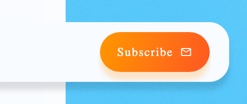
We can use Theme widget to wrap SubscribeButton() widget. Pass local theme ThemeData as data attribute of Theme widget, and add SubscribeButton() widget as child. In local ThemeData, you can overwrite primaryColor, secondaryHeaderColor and accentColor. I'm using orange hues in this example.
The benefit of this approach is to keep widgets theme agnostic. For example, branding logo is something that you may want to keep as is, even if you may want to change look and feel of all your app.
Expanded(
    flex: 2,
    child:
        //Example of applying local themes to a certain widget in app
        Theme(
      data: ThemeData(
        primaryColor: MyColors.orange1,
        secondaryHeaderColor: MyColors.orange2,
        accentColor: MyColors.orange3,
      ),
      child: SubscribeButton(),
    ))
This is how SubscribeButton would look like for all themes:
Part #3: How to use Custom Fonts in themes
Let's move on to be able to use custom fonts in your landing page. First, you may want to download (or get it from your designer) custom font of your choice from your favorite platform. I'm using Google fonts website to download custom font for this example. I want to use Indie Flower Font for my BlueTheme only. Configuring custom fonts in Flutter Web is slightly different than Flutter Native apps.
Custom fonts for Web :
Let's explore Flutter Web first:
- I've downloaded
IndieFlower.ttffrom Google Fonts Website. - Copy
IndieFlower.ttffile intoweb/assetsdirectory. - Create
FontManifest.jsonfile insideweb/assetsdirectory with following contents:
[
    {
        "family": "Indie Flower",
        "fonts": [
            {
                "asset": "IndieFlower.ttf"
            }
        ]
    }

]
- Update BlueTheme to include
fontFamilyas 'Indie Flower':
static ThemeData AppThemeBlue(BuildContext context) {
  return ThemeData(
    ...

    // I used custom font for the default font family.
    fontFamily: 'Indie Flower',

    ...
  );
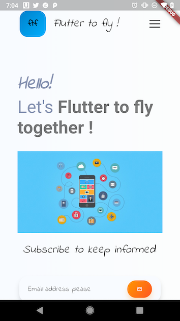
That's pretty much to it ! Here's screen shot of the web version:
Custom fonts on Native (Android, iOS) :
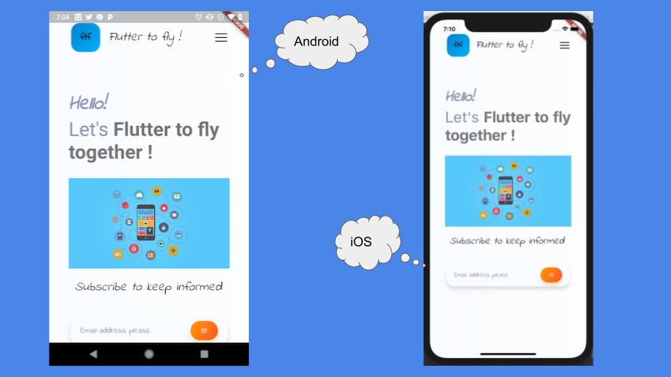
Let's make custom fonts work for native landing page. We would need to make two changes:
- Don't forget to update native version of flutter dependencies as described in my another article about running flutter landing page cross-platform on web and native.
- Copy over fonts file 'IndieFlower.ttf' inside fonts directory as
fonts/IndieFlower.ttfdirectory. - Update fonts related configuration in
pubspec.yaml:
fonts:
  - family: Indie Flower
    fonts:
      - asset: fonts/IndieFlower.ttf
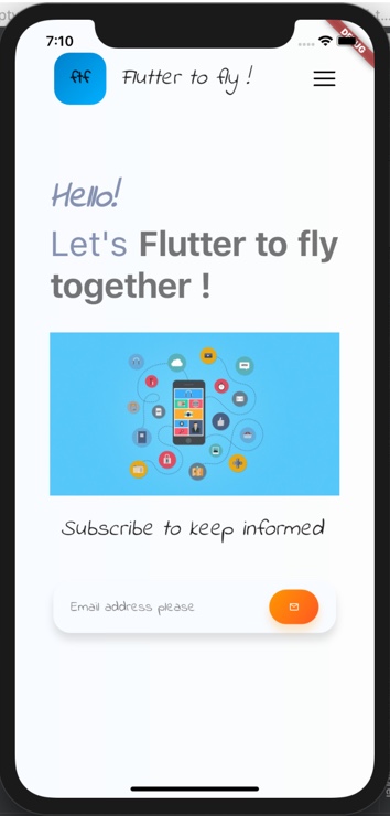
Screenshot of final landing page at Android platform:
Screenshot of final landing page at iOS platform:
Keep Fluttering !
Source code repo:
- Part #1 Source Code (Web)
- Part #2 Source Code (Web)
- Final Source Code (Web)
- Final Source Code (Native)
- Youtube playlist for Designing Flutter Landing page
References/Credits:
- Official Flutter Doc
- Making Cross-platform Flutter Landing Page Responsive
- Designing Cross platform Flutter prototype for Landing Page
Happy cooking with Flutter :)
Liked the article ? Couldn't find a topic of your interest ? Please leave comments or email me about topics you would like me to write ! BTW I love cupcakes and coffee both :)