Using ColorFiltered widget in Flutter Apps
Posted on September 17, 2019 in Flutter
Target Audience: Beginner
Recipe: Using ColorFiltered widget to update quiz card feedback screen's background color.
Focus Widget: ColorFiltered Widget
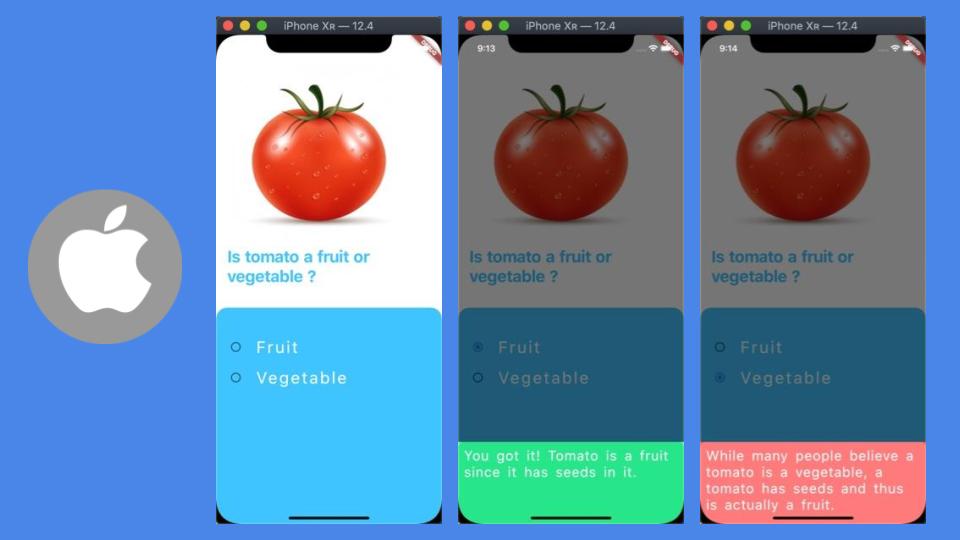
Goal: Update BottomSheet feedback widget's background color to reflect status of the correct or wrong answer to quiz question. A shade of red color is generated using color filter for wrong selection and green shade is for right answer.
NOTE: At the moment, ColorFiltered widget crashes on Chrome. Please refer to this issue at Flutter Github.
iOS QuizPage:
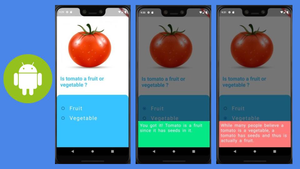
Android QuizPage:
Checkout the companion video tutorial:
Lets's go!
ColorFilter Widget is added to Flutter 1.9 release. This widget allows to generate dynamic and vibrant shades depending on the chosen blend modes, a part of dart.ui in Flutter framework's painting.dart file. I'm using BlendMode.hue mode to mix red and green colors with QuizPage's Colors.lightBlueAccent color.
NOTE: ColorFilter doesn't seem to work on Web. Refer to a related issue here.
Running the sample code
There are two ways that you can try out sample code in this recipe.
-
Running only
QuizzieDemo: This sample can be run independently. Make sure that you havevoid main() => runApp(QuizzieDemo());at the top of thequizze_demo.dartfile. -
Running as part of code recipe app: Should you choose this option, you can see other code recipes listed in home page.
Code Structure
There are two files:
1. quizze_demo.dart: Contains the entry point to the sample code recipe.
import 'package:flutter/material.dart';
import 'package:flutter_widgets/quizzie/quizze_page.dart';

//Note: Use code below to just run this demo.
// OR comment it out if you want to run it on Web as part of recipe sample app
void main() => runApp(QuizzieDemo());

class QuizzieDemo extends StatefulWidget {
  @override
  _QuizzieDemoState createState() => _QuizzieDemoState();
}

class _QuizzieDemoState extends State<QuizzieDemo> {
  @override
  Widget build(BuildContext context) {
    return MaterialApp(
      debugShowCheckedModeBanner: false,
      home: QuizPage(),
    );
  }
}
quizze_page.dart: Contains the code related to QuizPage, andColorFilterfor updating background color of feedback widget: BottomSheet.
Let's explore QuizPage Stateless widget in detail. There are three parts to QuizPage interface:
* Image widget for the quiz question.
* Text widget to describe question.
* Expanded widget to wrap answer options. We are using Expanded widget to fill the available space on the screen. All the answer options will be added as child under Expanded widget. QuizOptions() widget encapsulates choices / options for the quiz answers.
Check out the code QuizPage widget below:
class QuizPage extends StatelessWidget {
  @override
  Widget build(BuildContext context) {
    return Scaffold(
      backgroundColor: Colors.white,
      body: Column(
        children: <Widget>[
          Container(
            padding: EdgeInsets.only(top: 50, left: 20, right: 20, bottom: 20),
            child: Column(
              crossAxisAlignment: CrossAxisAlignment.start,
              children: <Widget>[
                Image.asset(
                  "assets/images/tomato.jpg",
                ),
                Text(
                  "Is tomato a fruit or vegetable ?",
                  style: TextStyle(
                    color: Colors.lightBlueAccent,
                    fontWeight: FontWeight.bold,
                    fontSize: 30,
                  ),
                ),
              ],
            ),
          ),
          SizedBox(
            height: 20,
          ),
          Expanded(
            child: Container(
              decoration: BoxDecoration(
                color: Colors.lightBlueAccent,
                borderRadius: BorderRadius.only(
                    topLeft: Radius.circular(20),
                    topRight: Radius.circular(20)),
              ),
              child: QuizOptions(),
            ),
          )
        ],
      ),
    );
  }
}
Now, it's time to build QuizOptions widget for quiz options. There can only be one answer selected at a time, so it makes sense to use RadioListTile to represent each answer option. QuizOptions must be a StatefulWidget since it's going to show feedback to user based on the state of the choice selection.
class QuizOptions extends StatefulWidget {
  @override
  _QuizOptionsState createState() => _QuizOptionsState();
}
Managing state takes place in _QuizOptionsState class. All options are wrapped in ListView. Using enum for Options make it easier to use in code.
enum Options { fruit, veggie, none }
_QuizOptionsState:
class _QuizOptionsState extends State<QuizOptions> {
  Options selection = Options.none;

  @override
  Widget build(BuildContext context) {
    return ListView(
      children: <Widget>[
        RadioListTile(
          title: Text(
            "Fruit",
            style:
                TextStyle(fontSize: 30, color: Colors.white, letterSpacing: 3),
          ),
          value: Options.fruit,
          groupValue: selection,
          onChanged: (Options value) =>
              setState(() => showAnswer(context, value)),
        ),
        RadioListTile(
          title: Text(
            "Vegetable",
            style:
                TextStyle(fontSize: 30, color: Colors.white, letterSpacing: 3),
          ),
          value: Options.veggie,
          groupValue: selection,
          onChanged: (Options value) =>
              setState(() => showAnswer(context, value)),
        )
      ],
    );
  }

...
}
When a selection is made, RadioListTile's 'onChanged method is invoked, and passes the current selection into showAnswer method as below. showAnswer updates the current selection to the option's value passed, and use showModalBottomSheet to show a modal Material design bottom sheet.
...

void showAnswer(BuildContext context, Options value) {
  selection = value;
  showModalBottomSheet(context: context, builder: buildBottomSheet);
}

...
showModalBottomSheet picks the explanation for the current choice, and uses ColorFiltered widget to apply color filter based on the right and wrong choice. ColorFiltered widget use FeedbackWidget as its child to display the feedback message. ColorFilter.mode(...) uses BlendMode.hue and response specific source color (Colors.greenAccent for correct response, and Colors.redAccent for wrong response). Its child widget FeedbackWidget has Colors.lightBlueAccent - destination color. ColorFiltered widget can apply filters based on its colorFilter attribute. It can blend source color with destination color based on the BlendMode, which is BlendMode.hue in our case.
Widget buildBottomSheet(BuildContext context) {
  String explanation = "";
  if (selection == Options.fruit) {
    explanation = "You got it! Tomato is a fruit since it has seeds in it.";

    return ColorFiltered(
      colorFilter: ColorFilter.mode(Colors.greenAccent, BlendMode.hue),
      child: FeedbackWidget(explanation: explanation),
    );
  } else {
    explanation =
        "While many people believe a tomato is a vegetable, a tomato has seeds and thus is actually a fruit.";

    return ColorFiltered(
      colorFilter: ColorFilter.mode(Colors.redAccent, BlendMode.hue),
      child: FeedbackWidget(explanation: explanation),
    );
  }
}
FeedbackWidget is a StatelessWidget. It shows feedback text message in a Container widget, with a BoxDecoration color as Colors.lightBlueAccent.
class FeedbackWidget extends StatelessWidget {
  const FeedbackWidget({
    Key key,
    @required this.explanation,
  }) : super(key: key);

  final String explanation;

  @override
  Widget build(BuildContext context) {
    return Container(
      height: 150,
      decoration: BoxDecoration(
          color: Colors.lightBlueAccent,
          //optional radius
          borderRadius: BorderRadius.only(
              topRight: Radius.circular(10), topLeft: Radius.circular(10))),
      child: Padding(
        padding:
            const EdgeInsets.only(top: 10, left: 10, right: 10, bottom: 10),
        child: Text(
          explanation,
          style: TextStyle(
              fontSize: 25,
              color: Colors.white,
              wordSpacing: 5,
              letterSpacing: 1),
        ),
      ),
    );
  }
}
And, you're done !
Source code repo: Recipe source code is available here
References:
Happy cooking with Flutter :)
Liked the article ? Couldn't find a topic of your interest ? Please leave comments or email me about topics you would like me to write ! BTW I love cupcakes and coffee both :)
Follow me at twitter