Making Cross-platform Flutter Landing Page Responsive (Web-Hummingbird, Android, iOS)
Posted on June 11, 2019 in Flutter
Goal: Our goal is to make Flutter page responsive for Web and Native apps.
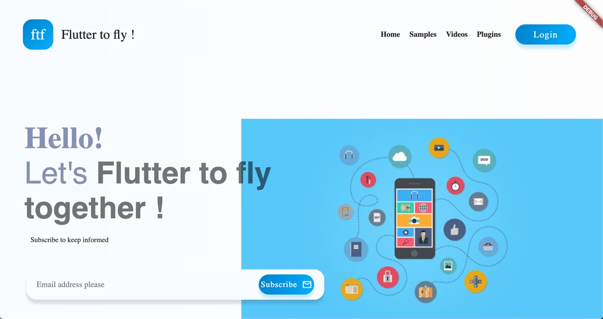
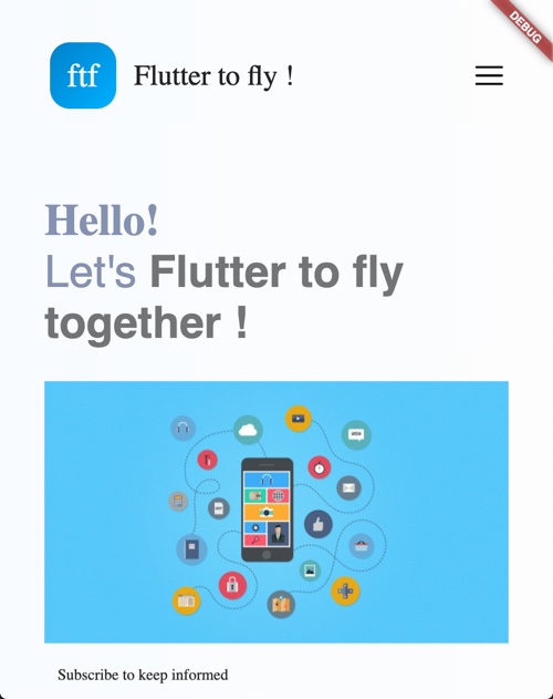
Web landing page:
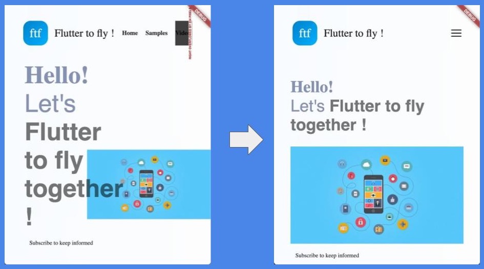
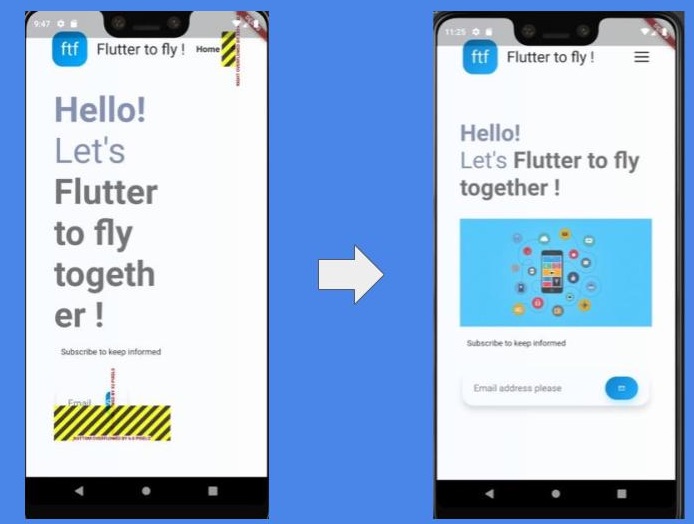
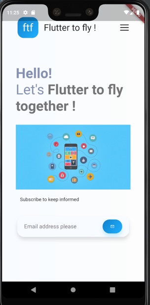
Native landing screen:
Introduction
This post is continuation of Designing Cross platform Flutter prototype for Landing Page. In this article, I'll show you how to make landing page responsive (meaning adapting to given screen size).
Checkout the companion videos:
Part-1:
Part-2:
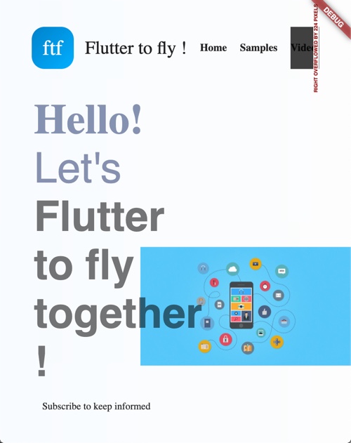
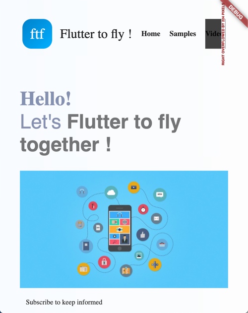
In previous post, we learned how to design and implement a cross-platform (Web, Android and iOS). It looked great on large screen like desktop/laptop. However, it's widgets overflown when web landing page was resized to smaller screen like below:
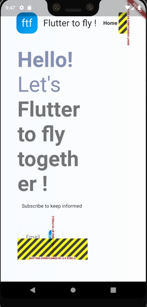
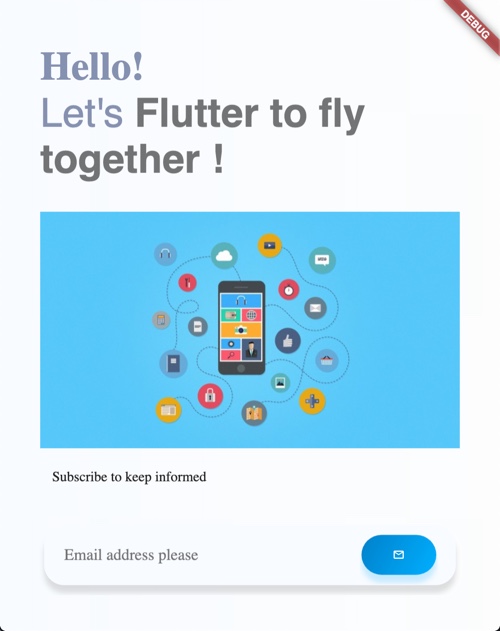
On native environment for a phone screen, it looked like this:
In this post, I'll be showing how to :
-
Implement a StatelessWidget
ResponsiveWidgetto support dynamic screen sizes. -
Adapt landing page's body to large vs smaller screens.
-
Adapt landing page's header to show menu icon at smaller screens.
ResponsiveWidget utility class
Let's implement a StatelessWidget ResponsiveWidget that uses LayoutBuilder. LayoutBuilder is a widget which builds a widget tree that can depend on the parent widget's size. This class is responsible for detecting the screen size, and put them in one of the three buckets: Large, Medium and Small. It has utility static functions/methods to check the screen sizes.
I'll be using MediaQuery to access the size of the screen. This is how I'll be checking the size of the screens by using width of the screen in pixels.
class ResponsiveWidget {
  ...
  //Large screen is any screen whose width is more than 1200 pixels
  static bool isLargeScreen(BuildContext context) {
    return MediaQuery.of(context).size.width > 1200;
  }

  //Small screen is any screen whose width is less than 800 pixels
  static bool isSmallScreen(BuildContext context) {
    return MediaQuery.of(context).size.width < 800;
  }

  //Medium screen is any screen whose width is less than 1200 pixels,
  //and more than 800 pixels
  static bool isMediumScreen(BuildContext context) {
    return MediaQuery.of(context).size.width > 800 &&
    MediaQuery.of(context).size.width < 1200;
  }
}
In the following section, I'll be building body of the landing page. In my previous post, I had only one design for landing page's body which is targeted to desktop size screens or say larger screens with width more than 1200 pixels. The widgets will give overflow signal when screen size is resized to smaller screen. To solve this problem, ideally you can design separate three designs for each of the screen buckets: Large, Medium and Small. In ResponsiveWidget's build function, appropriate implementation will be picked like below:
class ResponsiveWidget {
  ...
  final Widget largeScreen;
  final Widget mediumScreen;
  final Widget smallScreen;

  const ResponsiveWidget(
      {Key key, this.largeScreen, this.mediumScreen, this.smallScreen})
      : super(key: key);

  @override
  Widget build(BuildContext context) {
    //Returns the widget which is more appropriate for the screen size
    return LayoutBuilder(builder: (context, constraints) {
      if (constraints.maxWidth > 1200) {
        return largeScreen;
      } else if (constraints.maxWidth > 800 && constraints.maxWidth < 1200) {
        //if medium screen not available, then return large screen
        return mediumScreen ?? largeScreen;
      } else {
        //if small screen implementation not available, then return large screen
        return smallScreen ?? largeScreen;
      }
    });
  }
}
Adapting landing page's Body
This is how Body's widget look like from my previous posts. To make it responsive, we'll need different design implementations for each of the screen bucket. To keep things simple, I'll create only two layout implementations in this tutorial: Large and Small. Anything in Medium bucket will fall back to Large layout.
class Body extends StatelessWidget {

  @override
  Widget build(BuildContext context) {
    return SizedBox(
      height: 600,
      child: Stack(
        fit: StackFit.expand,
        children: <Widget>[
          addBackground(),
          addWelcomeText()
        ],
      ),
    );
  }
  ....
}
Our target Body widget build method to look like this:
import 'package:landingpage/utils/responsive_widget.dart';
class Body extends StatelessWidget {

@override
  Widget build(BuildContext context) {
    return ResponsiveWidget(
      largeScreen: LargeScreen(),
      smallScreen: SmallScreen(),
    );
  }
  ...
}
As you see that I imported responsive_widget.dart, and provided two implementations: LargeScreen() and SmallScreen(). One of the implementation will be rendered based on the screen size at runtime. You might have noticed that I've not provided MediumScreen(). In that case, it will fall back to LargeScreen() widget. Okay, let's get started implementing LargeScreen() first. Basically, we'll move existing layout into LargeScreen(). At this point large screen layout will look like this:
For SmallScreen(), we might need to do few tinkering. Like we need to put things in a Column inside SingleChildScrollView, and add all other widgets as its children. We do this to fit all widgets in vertical view to make every widget accessible when width is not sufficient to layout in horizontal manner. This is how SmallScreen() implementation will look like:
class SmallScreen extends StatelessWidget {
  @override
  Widget build(BuildContext context) {
    return SingleChildScrollView(
      child: Padding(
        padding: EdgeInsets.all(40),
        child: Column(
          crossAxisAlignment: CrossAxisAlignment.start,
          children: <Widget>[
            Text(
              Strings.hello,
              style: TextStyle(
                fontWeight: FontWeight.bold,
                fontSize: 40,
                color: MyColors.blue4,
              ),
            ),
            RichText(
              text: TextSpan(
                  text: Strings.welcomeTo,
                  style: TextStyle(fontSize: 40, color: MyColors.blue4),
                  children: [
                    TextSpan(
                        text: Strings.ftf,
                        style: TextStyle(
                            fontSize: 40,
                            fontWeight: FontWeight.bold,
                            color: Colors.black54))
                  ]),
            ),
            SizedBox(
              height: 30,
            ),
            Center(
              child: Image.network(
                backgroundImage,
                scale: 1,
              ),
            ),
            Padding(
              padding: EdgeInsets.only(left: 12.0, top: 20),
              child: Text(Strings.subscribeText),
            ),
            SizedBox(
              height: 30,
            ),
            EmailBox(),
            SizedBox(
              height: 30,
            )
          ],
        ),
      ),
    );
  }
}
At this point small screen layout will look like below. You'll notice that background image is moved to bottom under the welcome text, and above the "subscribe to keep informed" text. In larger screen background image was towards the right side of the page. This is because we've added background image below the welcome text. Observe the code snippet above. Overall landing page on small screen looks balanced.
However, there're still two issues with this layout:
First, "EmailBox" to inputting email addresses is aligned towards left and far away from right side. This is because of right padding "74". We would need to make it to same as of left side padding to keep this box in center. Let's set EmailBox widget right padding to "4" for smaller screens.
class EmailBox extends StatelessWidget {
  @override
  Widget build(BuildContext context) {
    return Padding(
      padding: EdgeInsets.only(
          left: 4.0,
          right: ResponsiveWidget.isSmallScreen(context) ? 4: 74, //Check for screen type
          top: 10,
          bottom: 40),
          ....

    }
}
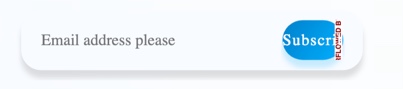
Second, you might notice that "Subscribe" button still have overflow text like shown in screenshot below:
Let's fix the overflow text issue with SubscribeButton.
There're three places, where we need to adjust the size rendering to fit on smaller screens.
- Make the font of the text "Subscribe" on button adaptive to the screen at run time.
Text(
    Strings.subscribeButton,
    style: TextStyle(
        color: MyColors.white1,
        fontSize: ResponsiveWidget.isSmallScreen(context)
            ? 12
            : ResponsiveWidget.isMediumScreen(context)
                ? 12
                : 16,
        letterSpacing: 1),
  ),
- Make spacing between text and image adaptive to the screen at run time. On Smaller screen make it 4, on medium 6 and for larger screens 8.
SizedBox(
  width: ResponsiveWidget.isSmallScreen(context)
      ? 4
      : ResponsiveWidget.isMediumScreen(context) ? 6 : 8,
),
- Last thing is to make image size adjustable to screen size.
Image.network(
  emailImage,
  color: MyColors.white1,
  width: ResponsiveWidget.isSmallScreen(context)
      ? 12
      : ResponsiveWidget.isMediumScreen(context) ? 12 : 20,
  height: ResponsiveWidget.isSmallScreen(context)
      ? 12
      : ResponsiveWidget.isMediumScreen(context) ? 12 : 20,
)
However this doesn't solve the problem fully. For small screens "Subscribe" text and "email" icon is just too much to adjust together next to each other. So you've to be creative with your design here. In my case, I only used email image for button and skipped "Subscribe" text on button. I created two different variants for buttons. One for smaller screen and another for larger screen.
Widget buildButton(BuildContext context) {
  if (ResponsiveWidget.isSmallScreen(context))
    return buildSmallButton(context);
  else
    return buildLargeButton(context);
}
Here, I'm showing only small button implementation. Refer to code to checkout our large button implementation.
Widget buildSmallButton(BuildContext context) {
  return Row(
    mainAxisAlignment: MainAxisAlignment.center,
    children: <Widget>[
      Image.network(
        emailImage,
        color: MyColors.white1,
        width: ResponsiveWidget.isSmallScreen(context)
            ? 12
            : ResponsiveWidget.isMediumScreen(context) ? 12 : 20,
        height: ResponsiveWidget.isSmallScreen(context)
            ? 12
            : ResponsiveWidget.isMediumScreen(context) ? 12 : 20,
      )
    ],
  );
}
Note: I'm using Chrome's inspect mode to checkout layout on different screen layouts.
Screenshot below shows the Small button :
At this point, we've made body of the landing page responsive. Now let's make header responsive.
Adapting landing page's Header
In large screens, there's enough room to show all navigation links. However, as far as smaller screens are concerned, there's not enough space to show all links next to each other. For smaller screens, it makes sense to show a menu icon. Clicking on menu icon can bring up all the links. Implementing menu icon interaction is out of the scope of this article.
class Header {
  ...
  //Builds navigation links at the right top of landing page
  Widget buildHeaderLinks(BuildContext context) {
    if (!ResponsiveWidget.isSmallScreen(context))
      return Row(
        mainAxisAlignment: MainAxisAlignment.spaceAround,
        children: getLinksListing()..add(buildLoginButton()),
      );
    else
      return Image.network("assets/menu.png", width: 25, height: 25);
  }
  ...
}
Note: Image.network needs to be replaced with Image.asset for Native implementation.
So, this concludes making landing page responsive for all screen form factors.
Running in Native environment
You may want to make few changes to adapt to native code. I've native source code available here
Image.networkneeds to be replaced withImage.asset.flutter_webimports need to be replaced with it's native variantflutter.
Responsive page at Native platform looks like below in Android:
Keep Fluttering !
Source code repo:
- Source code for web
- Source code for Native
- Youtube playlist for Designing Flutter Landing page
Happy cooking with Flutter :)
Liked the article ? Couldn't find a topic of your interest ? Please leave comments or email me about topics you would like me to write ! BTW I love cupcakes and coffee both :)