Custom switch widget for accepting Privacy Policy in Flutter Apps
Posted on August 30, 2019 in Flutter
Target Audience: Beginner
Recipe: Implementing Custom Switch Widget to accept privacy policy from Settings screen.
Focus Widget: Switch Widget
Goal: In our demo app, we'll implement a custom stateless widget HyperlinkedLabelSwitch. It'll contain two main visual parts:
-
Label 'Privacy Policy' aligned to start. Clicking / tapping on this label will open url in a
WebView. I'll be using a Google Doc for sample privacy policy accessible via a hyperlink. -
Toggle switch aligned to the end of the screen. On switch means privacy policies are accepted. This accepted status is updated as 'Privacy Policy (Accepted)' in left label. Toggling this switch to "off" update text label back to 'Privacy Policy'.
Screenshot of Privacy policy loaded in WebView:

Screenshot of updated text label after accepting privacy policy:
Checkout the companion video tutorial:
Implementing Custom Switch Widget : HyperlinkedLabelSwitch
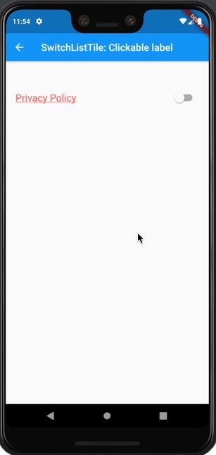
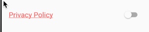
We'll be creating custom switch widget with clickable text label and switch. Screenshot of custom widget in 'off' mode (Privacy privacy is not accepted):
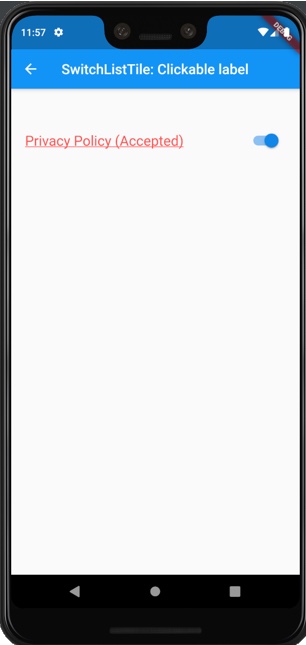
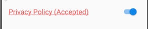
Screenshot of custom widget in 'on' mode (Privacy privacy accepted):
Step #1. Create a class HyperlinkedLabelSwitch extending StatelessWidget. This widget has following members:
label: Text displaying 'Privacy Policy'hyperlink: Web link (url) to privacy policy document.selected: Boolean value to determine whether policy is accepted or not.onChange: Function to be assigned toSwitchwidget'sonChanged:property.padding: This is the padding around the custom widget. Ability to pass this value (rather hard coding) from parent make custom widget reusable.
class HyperlinkedLabelSwitch extends StatelessWidget {
  final String label;
  final String hyperlink;
  final bool selected;
  final Function onChange;
  final EdgeInsets padding;
}
Now, let's build the custom widget that contains a clickable label and toggle switch. We need a padding around this widget for visual appeal. We'll use the padding passed from parent as padding parameter.
I'm using Row widget to put label and toggle switch next to each other. Clickable label stays at the start of the screen, so it'll be the first child, and Switch widget is placed as second children to the Row widget. Since label consist of text, and it gets updated when user accepts the privacy policy, so we need it keep this widget flexible. We need to allow it to expand to claim the available space. That's why we'll use Expand widget to claim empty area.
@override
Widget build(BuildContext context) {
  return Padding(
    padding: padding,
    child: Row(
      children: <Widget>[
        Expanded(),
        Switch()
      ],
    ),
  );
}
I'll make use of RichText widget to create clickable text label. TextSpan widget is great choice for rendering more than just plain text. It's recognizer property can be used for responding to gestures more appropriately. In this case, I'll use TapGestureRecognizer as recognizer. TapGestureRecognizer helps to disambiguate gestures from other potential gestures. Clicking / tapping on link will open up the url in a WebView. In this example, it's a Google Doc with sample privacy policy text in it. Let's put all it together as code below:
Expanded(
  child: RichText(
      text: TextSpan(
          text: label,
          style: TextStyle(
              color: Colors.redAccent,
              decoration: TextDecoration.underline,
              fontSize: 20.0),
          //TapGestureRecognizer helps to disambiguate gestures from other potential gestures
          recognizer: TapGestureRecognizer()
            ..onTap = () {
              //open hyperlink in webview
              Navigator.pushNamed(context, WEBVIEW,
                  arguments:
                      WebViewArguments(title: label, url: hyperlink));
            })),
),
Next comes the Switch widget. It's fairly simple. Widget's value, onChanged attributes are assigned values from parent widget. selected boolean is assigned to value, and onChange() is assigned to onChanged attribute like below:
Switch(
  value: selected,
  onChanged: (bool v) {
    onChange(v);
  },
)
That's all to it. We're ready to move on to using this widget from another widget or page. Settings page is one example where this widget can be used in to create clickable label along with switch settings.
Using Custom Switch Widget
I've created a sample page SwitchListTile1 to demonstrate integrating our brand new custom widget HyperlinkedLabelSwitch. SwitchListTile1 page is a StatefulWidget. We chose it to be StatefulWidget because we want to update the value of toggle switch to reflect privacy policy acceptance status.
As usual, we need a State for StatefulWidget, say _SwitchListTileState like below:
class SwitchListTile1 extends StatefulWidget {
  @override
  State<StatefulWidget> createState() {
    return _SwitchListTileState();
  }
}

class _SwitchListTileState extends State<SwitchListTile1> {
}
_SwitchListTileState has two parameters:
1. accepted: A boolean flag to keep track of state of privacy policy acceptance status.
2. privacyLabel: Text message shown to user. It's 'Privacy Policy' by default. It changes to 'Privacy Policy (Accepted)', when accepted is true.
The body of this sample page is simple, and consists of one Column widget. This Column has only one child HyperlinkedLabelSwitch widget.
HyperlinkedLabelSwitch is initialized with default values for privacyLabel and accepted. The value of hyperlink remains constant and hence hard wired, since we don't accept the location of privacy policy to be changed frequently. setState(){} is called whenever value of switch changes. privacyLabel's value is updated to include (Accepted) when accepted is true.
body: Column(
  children: <Widget>[
    HyperlinkedLabelSwitch(
      padding:
          const EdgeInsets.symmetric(horizontal: 20.0, vertical: 50.0),
      label: privacyLabel,
      hyperlink:
          'https://docs.google.com/document/d/1TAqTE7MBzuIagISHHzjGxSHoY1z884LXR3iGIojz1sA/edit?usp=sharing',
      selected: accepted,
      onChange: (bool v) {
        setState(() {
          accepted = v;
          if (accepted) {
            privacyLabel = 'Privacy Policy (Accepted)';
          } else {
            privacyLabel = 'Privacy Policy';
          }
        });
      },
    )
  ],
)
and, we are done !
Next section has complete example code for easy reference.
Complete example code
This section has full example code for your reference. There are few dependencies like webview.dart, router.dart. They are meant to be included for app navigation purposes and showing privacy policy documents in a web view. Please refer to Github repo for access to full code.
import 'package:flutter/gestures.dart';
import 'package:flutter/material.dart';
import 'package:flutter_widgets/menus/webview.dart';
import 'package:flutter_widgets/router.dart';

class SwitchListTile1 extends StatefulWidget {
  @override
  State<StatefulWidget> createState() {
    return _SwitchListTileState();
  }
}

class _SwitchListTileState extends State<SwitchListTile1> {
  bool accepted = false;
  String privacyLabel = 'Privacy Policy';

  @override
  Widget build(BuildContext context) {
    return Scaffold(
      appBar: AppBar(
        title: Text("SwitchListTile: Clickable label"),
      ),
      body: Column(
        children: <Widget>[
          HyperlinkedLabelSwitch(
            padding:
                const EdgeInsets.symmetric(horizontal: 20.0, vertical: 50.0),
            label: privacyLabel,
            hyperlink:
                'https://docs.google.com/document/d/1TAqTE7MBzuIagISHHzjGxSHoY1z884LXR3iGIojz1sA/edit?usp=sharing',
            selected: accepted,
            onChange: (bool v) {
              setState(() {
                accepted = v;
                if (accepted) {
                  privacyLabel = 'Privacy Policy (Accepted)';
                } else {
                  privacyLabel = 'Privacy Policy';
                }
              });
            },
          )
        ],
      ),
    );
  }
}

class HyperlinkedLabelSwitch extends StatelessWidget {
  final String label;
  final String hyperlink;
  final bool selected;
  final Function onChange;
  final EdgeInsets padding;


  const HyperlinkedLabelSwitch(
      {Key key,
      this.label,
      this.selected,
      this.onChange,
      this.padding,
      this.hyperlink});

  @override
  Widget build(BuildContext context) {
    return Padding(
      padding: padding,
      child: Row(
        children: <Widget>[
          //1. First widget in row is for label
          //Expanded widget claims the empty area
          Expanded(
            child: RichText(
                text: TextSpan(
                    text: label,
                    style: TextStyle(
                        color: Colors.redAccent,
                        decoration: TextDecoration.underline,
                        fontSize: 20.0),
                    //TapGestureRecognizer helps to disambiguate gestures from other potential gestures
                    recognizer: TapGestureRecognizer()
                      ..onTap = () {
                        //open hyperlink in webview
                        Navigator.pushNamed(context, WEBVIEW,
                            arguments:
                                WebViewArguments(title: label, url: hyperlink));
                      })),
          ),

          //2. Next comes the switch to save the user's selection
          Switch(
            value: selected,
            onChanged: (bool v) {
              onChange(v);
            },
          )
        ],
      ),
    );
  }
}
Source code repo: Recipe source code is available here
References:
Happy cooking with Flutter :)
Liked the article ? Couldn't find a topic of your interest ? Please leave comments or email me about topics you would like me to write ! BTW I love cupcakes and coffee both :)
Follow me at twitter