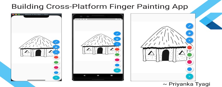
Building Cross-Platform Finger Painting App in Flutter
Posted on March 31, 2020 in Flutter
Target Audience: Beginner
Recipe: In this code recipe, you'll use canvas painting to build a Finger Painting App in Flutter.
Focus Widget(s): GestureDetector, CustomPaint
Goal: We'll implement the following items in this Finger Painting Flutter App :
- Drawing / Painting Area: This is the main area of the screen where an image can be displayed to color or draw more details to it.
- Action Items: A Floating Action Button (FAB) menu to store all the menu items to make color, stroke, and opacity selections.
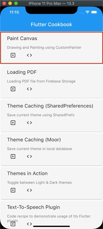
Flutter Cookbook:
This code recipe is added to Flutter Cookbook as well:
Checkout the companion video tutorial:
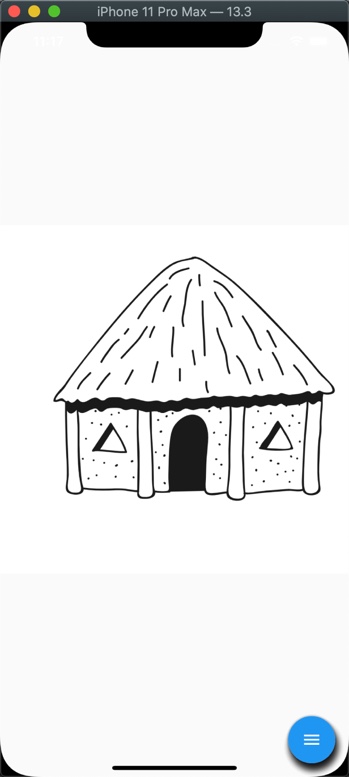
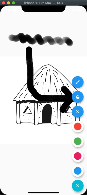
Drawing / Painting Area
Let's go ahead with building main area of the finger painting app. In this app, a picture of hut is displayed as background to color in. User can color this page while adding more details to the picture using tools provided by the app.
We'll be using 'StatefulWidget' to implement the app. This is because we need to convert the user's tap into drawing/painting while updating the finger movement on the screen.
Note: You can either choose to run this sample from main() method or invoke it from Flutter Cookbook app as mentioned above.
//Optional app's entry point. Uncomment if running only this file.
//Note: Following line should be commented out when running Flutter Cookbook App on Web platform
void main() => runApp(CanvasPainting());

//StatefulWidget
class CanvasPainting extends StatefulWidget {
  @override
  _CanvasPaintingState createState() => _CanvasPaintingState();
}

class _CanvasPaintingState extends State<CanvasPainting> {
 ...
  @override
  Widget build(BuildContext context) {
    return MaterialApp(
      debugShowCheckedModeBanner: false,
      home: Scaffold(
        body: //Main canvas goes here,
        floatingActionButton: //FAB for the menu items goes here,
      ),
    );
  }
 ...
}
Detecting gestures:
We need a way to capture the user's tap. The GestureDetector widget is used to detect gestures. This widget is assigned to Scaffold widget's body property.
Since we want to paint on the given hut image. Feel free to use another image if you would like. However, don't forget to add this image to assets/images folder. Put this image in the center of the screen using Center widget. We want to draw on top of this image, so put this widget inside a Stack widget. Add CustomPaint as another child to this Stack widget.
CustomPaint widget takes two attributes. First, size of the canvas to be considered for drawing. Assign Size.infinite to size property because we want flexibility to be able draw anywhere on the screen.
Second, assign painter property to an instance of CustomPainter widget. We'll create a class MyPainter which extends CustomPainter. MyPainter class needs pointsList. This is the list of coordinates where screen is being touched. This information is required to draw either a line or a point on the screen.
//List of points touched at screen
List<TouchPoints> points = List();
  ...
body: GestureDetector(
  child: Stack(
    children: <Widget>[
      Center(
        child: Image.asset("assets/images/hut.png"),
      ),
      CustomPaint(
        size: Size.infinite,
        painter: MyPainter(
          pointsList: points,
        ),
      ),
    ],
  ),
),
The TouchPoints class:
This class holds the point information where screen is being touched.
//Class to define a point touched at canvas
class TouchPoints {
  Paint paint;
  Offset points;
  TouchPoints({this.points, this.paint});
}
MyPainter class:
The MyPainter class extends CustomPainter. It tells system how and when the screen will be painted. When two consecutive points are available, a line is detected otherwise a point is drawn.
class MyPainter extends CustomPainter {
  MyPainter({this.pointsList});

  //Keep track of the points tapped on the screen
  List<TouchPoints> pointsList;
  List<Offset> offsetPoints = List();

  //This is where we can draw on canvas.
  @override
  void paint(Canvas canvas, Size size) {
    for (int i = 0; i < pointsList.length - 1; i++) {
      if (pointsList[i] != null && pointsList[i + 1] != null) {

        //Drawing line when two consecutive points are available
        canvas.drawLine(pointsList[i].points, pointsList[i + 1].points,
            pointsList[i].paint);
      } else if (pointsList[i] != null && pointsList[i + 1] == null) {
        offsetPoints.clear();
        offsetPoints.add(pointsList[i].points);
        offsetPoints.add(Offset(
            pointsList[i].points.dx + 0.1, pointsList[i].points.dy + 0.1));

        //Draw points when two points are not next to each other
        canvas.drawPoints(PointMode.points, offsetPoints, pointsList[i].paint);
      }
    }
  }

  //Called when CustomPainter is rebuilt.
  //Returning true because we want canvas to be rebuilt to reflect new changes.
  @override
  bool shouldRepaint(MyPainter oldDelegate) => true;
}
At this point, our canvas is ready to process the touched points on the screen. However, we need to add detect and register this touched down points. For this purpose, we'll use GestureDetector widget's following properties:
- The
onPanStartproperty:
This property records the initial touched points. It requires paint property to provide information how touched points would be rendered on the screen. It extracts the position of touched points using RenderBox widget. A RenderBox is a render object in a 2D Cartesian coordinate system.
Here's description of this property from its class:
A pointer has contacted the screen with a primary button and has begun to move.
 onPanStart: (details) {
  setState(() {
    RenderBox renderBox = context.findRenderObject();
    points.add(TouchPoints(
        points: renderBox.globalToLocal(details.globalPosition),
        paint: Paint()
          ..strokeCap = strokeType
          ..isAntiAlias = true
          ..color = selectedColor.withOpacity(opacity)
          ..strokeWidth = strokeWidth));
  });
},
Let's define default properties for Paint() object as below:
 double opacity = 1.0;
 StrokeCap strokeType = StrokeCap.round;
 double strokeWidth = 3.0;
 Color selectedColor = Colors.black;
- The
onPanUpdateproperty:
This property is used to update the moving coordinates. For example, user is drawing a line without lifting off their finger.
Here's description of this property from its class:
A pointer that is in contact with the screen with a primary button and moving has moved again.
 onPanUpdate: (details) {
   setState(() {
     RenderBox renderBox = context.findRenderObject();
     points.add(TouchPoints(
         points: renderBox.globalToLocal(details.globalPosition),
         paint: Paint()
           ..strokeCap = strokeType
           ..isAntiAlias = true
           ..color = selectedColor.withOpacity(opacity)
           ..strokeWidth = strokeWidth));
   });
 },
- The
onPanEndproperty:
This point describes the end of the screen contact with finger. So null is added to points list because there's no TouchPoints to be recorded.
Here's description of this property from its class:
A pointer that was previously in contact with the screen with a primary button and moving is no longer in contact with the screen and was moving at a specific velocity when it stopped contacting the screen.
 onPanEnd: (details) {
  setState(() {
    points.add(null);
  });
},
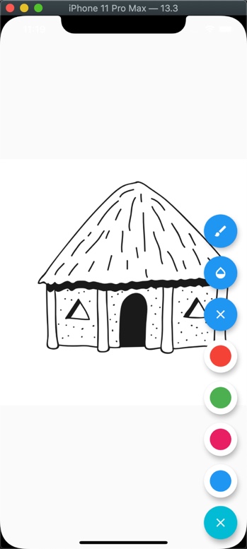
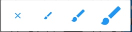
Action Items
There are following 7 action items that we want to add our toolkit.
- Brush Stroke Picker
- Opacity Picker
- Resetting Screen
- Red Color Picker
- Green Color Picker
- Pink Color Picker
- Blue Color Picker
Add FAB menu
The FAB menu is implemented using AnimatedFloatingActionButton widget. This widget provides nice and smooth animation for menu open and close actions. It's assigned to Scaffold widget using floatingActionButton property.
pubspec.yaml Configuration
The AnimatedFloatingActionButton widget is provided by a Flutter plugin. Add plugin animated_floatactionbuttons: ^0.1.0 to pubspec.yaml
animated_floatactionbuttons: ^0.1.0
Note: Don't forget to fetch the flutter packages after adding dependency.
Animating FAB
When FAB menu is clicked, it shows swift animation. We provide colors for starting and ending animation.
The Colors.blue is used as starting animation color. This can be assigned using colorStartAnimation property. The property colorEndAnimation is used to assign ending animation color, Colors.cyan.
When FAB menu open and closes, its icon(s) is changed using animatedIconData property.
This is how different colors can be assigned to AnimatedFloatingActionButton widget:
floatingActionButton: AnimatedFloatingActionButton(

  //Color shown when animation starts
  colorStartAnimation: Colors.blue,

  //Color shown when animation ends
  colorEndAnimation: Colors.cyan,

  //Icon for FAB. 'X' icon is shown when menu is open.
  animatedIconData: AnimatedIcons.menu_close,
),
Adding the buttons to FAB
The fabButtons property takes the buttons to be added to the AnimatedFloatingActionButton widget.
We'll create fabOption() to return list of widgets to be shown as menu items.
Checkout the full code below:
//Optional app's entry point
void main() => runApp(CanvasPainting());

//StatefulWidget
class CanvasPainting extends StatefulWidget {
  @override
  _CanvasPaintingState createState() => _CanvasPaintingState();
}

class _CanvasPaintingState extends State<CanvasPainting> {
 ...
  @override
  Widget build(BuildContext context) {
    return MaterialApp(
      debugShowCheckedModeBanner: false,
      home: Scaffold(
        body: //Main canvas goes here,

        //FAB to implement expandable menu
        //needs plugin: `animated_floatactionbuttons`
        floatingActionButton: AnimatedFloatingActionButton(

          //Creating menu items
          fabButtons: fabOption(),

          //Color shown when animation starts
          colorStartAnimation: Colors.blue,

          //Color shown when animation ends
          colorEndAnimation: Colors.cyan,

          //Icon for FAB
          animatedIconData: AnimatedIcons.menu_close,
        ),
      ),
    );
  }
 ...
}
Let's checkout the fabOption() method next.
The fabOption() method
The method fabOption() returns the list of all menu items in the FAB menu. Assign this method to AnimatedFloatingActionButton widget using fabButtons property.
List<Widget> fabOption() {
  return <Widget>[

    //FAB for choosing stroke
    FloatingActionButton(
      heroTag: "paint_stroke",
      child: Icon(Icons.brush),
      tooltip: 'Stroke',
      onPressed: () {
        //min: 0, max: 50
        setState(() {
          _pickStroke();
        });
      },
    ),

    //FAB for choosing opacity
    FloatingActionButton(
      heroTag: "paint_opacity",
      child: Icon(Icons.opacity),
      tooltip: 'Opacity',
      onPressed: () {
        //min:0, max:1
        setState(() {
          _opacity();
        });
      },
    ),

    //FAB for resetting screen
    FloatingActionButton(
        heroTag: "erase",
        child: Icon(Icons.clear),
        tooltip: "Erase",
        onPressed: () {
          setState(() {
            points.clear();
          });
        }),

    //FAB for picking red color
    FloatingActionButton(
      backgroundColor: Colors.white,
      heroTag: "color_red",
      child: colorMenuItem(Colors.red),
      tooltip: 'Color',
      onPressed: () {
        setState(() {
          selectedColor = Colors.red;
        });
      },
    ),

    //FAB for picking green color
    FloatingActionButton(
      backgroundColor: Colors.white,
      heroTag: "color_green",
      child: colorMenuItem(Colors.green),
      tooltip: 'Color',
      onPressed: () {
        setState(() {
          selectedColor = Colors.green;
        });
      },
    ),

    //FAB for picking pink color
    FloatingActionButton(
      backgroundColor: Colors.white,
      heroTag: "color_pink",
      child: colorMenuItem(Colors.pink),
      tooltip: 'Color',
      onPressed: () {
        setState(() {
          selectedColor = Colors.pink;
        });
      },
    ),

    //FAB for picking blue color
    FloatingActionButton(
      backgroundColor: Colors.white,
      heroTag: "color_blue",
      child: colorMenuItem(Colors.blue),
      tooltip: 'Color',
      onPressed: () {
        setState(() {
          selectedColor = Colors.blue;
        });
      },
    ),
  ];
}
Opacity Picker
The Opacity widget makes its child partially transparent. We want to support three values in our toolkit to pick from: 0.1, 0.5, and 1.0. The 0.1 is most transparent while 1.0 not at all. These options are shown in a alert dialog like below:
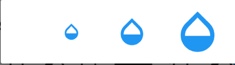
This is how your stroke look for opacity value of 0.1:
Implementing _opacity() method:
The _opacity() method implements selection of opacity as show in the screenshot.
We're providing three different values for opacity. The opacity = 1.0 is the maximum opacity. All options are displayed in AlertDialog widget. Selecting one option closes the dialog.
We'll use barrierDismissible to enable user to tap anywhere on the screen to close this dialog box.
ClipOval widget is used to create an oval shape clip of its child. You would notice slightly rounded corners for AlertDialog child.
Future<void> _opacity() async {
  //Shows AlertDialog
  return showDialog<void>(
    context: context,

    //Dismiss alert dialog when set true
    barrierDismissible: true,

    builder: (BuildContext context) {

      //Clips its child in a oval shape
      return ClipOval(
        child: AlertDialog(

          //Creates three buttons to pick opacity value.
          actions: <Widget>[
            FlatButton(
              child: Icon(
                Icons.opacity,
                size: 24,
              ),
              onPressed: () {
                //most transparent
                opacity = 0.1;
                Navigator.of(context).pop();
              },
            ),
            FlatButton(
              child: Icon(
                Icons.opacity,
                size: 40,
              ),
              onPressed: () {
                opacity = 0.5;
                Navigator.of(context).pop();
              },
            ),
            FlatButton(
              child: Icon(
                Icons.opacity,
                size: 60,
              ),
              onPressed: () {
                //not transparent at all.
                opacity = 1.0;
                Navigator.of(context).pop();
              },
            ),
          ],
        ),
      );
    },
  );
}
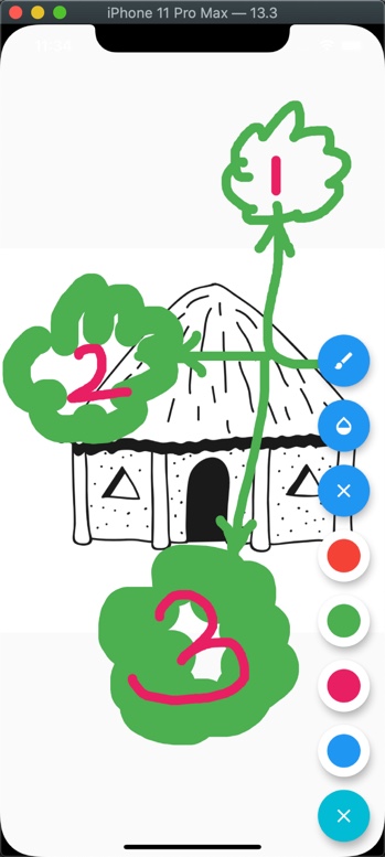
Brush Stroke Picker
The strokeWidth property sets the width of the stroke. .
These options are shown in the alert dialog like below. The 'X' is for resetting the stroke to its default value. The other three values are 10.0(thicker than default), 30.0, and 50.0 (thickest stroke).
The following screenshot shows all three options marked as 1, 2, and 3, where 1 is 10.0, 2 is 30.0, and 3 is 50.0.
Implementing _pickStroke() method:
The _pickStroke() method implements selection of the stroke.
We're providing four different width of strokes. All options are displayed in the
AlertDialog widget. Selecting one option closes the dialog.
Future<void> _pickStroke() async {

  //Shows AlertDialog
  return showDialog<void>(
    context: context,

    //Dismiss alert dialog when set true
    barrierDismissible: true, // user must tap button!
    builder: (BuildContext context) {

      //Clips its child in a oval shape
      return ClipOval(
        child: AlertDialog(

          //Creates three buttons to pick stroke value.
          actions: <Widget>[

            //Resetting to default stroke value
            FlatButton(
              child: Icon(
                Icons.clear,
              ),
              onPressed: () {
                strokeWidth = 3.0;
                Navigator.of(context).pop();
              },
            ),
            FlatButton(
              child: Icon(
                Icons.brush,
                size: 24,
              ),
              onPressed: () {
                strokeWidth = 10.0;
                Navigator.of(context).pop();
              },
            ),
            FlatButton(
              child: Icon(
                Icons.brush,
                size: 40,
              ),
              onPressed: () {
                strokeWidth = 30.0;
                Navigator.of(context).pop();
              },
            ),
            FlatButton(
              child: Icon(
                Icons.brush,
                size: 60,
              ),
              onPressed: () {
                strokeWidth = 50.0;
                Navigator.of(context).pop();
              },
            ),
          ],
        ),
      );
    },
  );
}
Resetting Screen
Resetting screen clears all the recorded points:
points.clear();
Red, Green, Pink & Blue Color Picker(s)
The colorMenuItem(Color color) method provides the icon(s) for the given color(s). Tapping on that icon makes the color selection. ClipOval widget is used to give smooth round shape to colored icon.
Widget colorMenuItem(Color color) {
  return GestureDetector(
    onTap: () {
      setState(() {
        selectedColor = color;
      });
    },
    child: ClipOval(
      child: Container(
        padding: const EdgeInsets.only(bottom: 8.0),
        height: 36,
        width: 36,
        color: color,
      ),
    ),
  );
}
The above colorMenuItem(...) method is used to create oval menu items for all the four colors.
That's all for this article. Hope you've your own finger painting app on your finger tips :)
NOTE: This code has been developed in following dev environment:
Flutter 1.15.17 • channel beta • https://github.com/flutter/flutter.git
Framework • revision 2294d75bfa (4 weeks ago) • 2020-03-07 00:28:38 +0900
Engine • revision 5aff311948
Tools • Dart 2.8.0 (build 2.8.0-dev.12.0 9983424a3c)
Source code repo
References:
Happy cooking with Flutter :)
Liked the article ? Couldn't find a topic of your interest ? Please leave comments or email me about topics you would like me to write ! BTW I love cupcakes and coffee both :)
Follow me at twitter