Animating using AnimatedPadding Flutter widget
Posted on November 15, 2019 in Flutter
Introduction
AnimatedPadding widget is the animated version of the Padding widget.
In this article, we'll see how AnimatedPadding widget is used to animate an image in it. We'll observe animation behavior for various types of curves.
Target Audience: Beginner
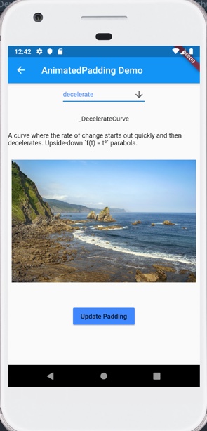
Recipe: Animating an image in AnimatedPadding widget.
Focus Widget: AnimatedPadding
Goal: Animate an image inside AnimatedPadding using various types given AnimationCurves
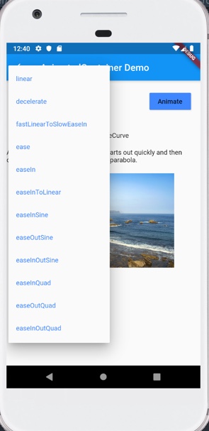
AnimationCurves:
Checkout YouTube video:
Structure of AnimatedPadding widget
AnimatedPadding uses duration and curve properties to animate from previous value of inset to a newer value. The duration value controls how long animation would take whereas curve property's value provides the type of animation Curve
AnimatedPadding(
          padding: EdgeInsets.all(paddingValue),
          duration: Duration(seconds: 2),
          curve:
              dropDownValue != null ? dropDownValue.curveCubic : Curves.linear,
          child: Image.asset('assets/images/sea.jpg'),
        ),
Recipe's Code Structure
I'm using a drop down to choose the different type of curve. Animation curves used in this code recipe are available in the source code as well as here.
AnimatedPadding needs to be implemented inside a StatefulWidget since it can only animate when inset value is updated.
AnimationCurve dropDownValue holds the current selection from the AnimationCurves drop down widget.
class AnimatedPaddingDemo extends StatefulWidget {
  @override
  _AnimatedPaddingDemoState createState() => _AnimatedPaddingDemoState();
}

class _AnimatedPaddingDemoState extends State<AnimatedPaddingDemo> {
  AnimationCurve dropDownValue;
  bool selected = false;
  double paddingValue = 8.0;

  ...
}
Boolean selected keeps track of when 'Update padding' button is pressed or image is touched.
'Update padding' button next to dropDown widget. It updates the value of selected as below:
Widget playAnimation(BuildContext context) {
  return RaisedButton(
    color: Colors.blueAccent,
    child: Text("Update Padding"),
    onPressed: () => setState(() {
      selected = !selected;
      selected ? paddingValue = 40 : paddingValue = 8.0;
    }),
  );
}
Implementing AnimatedPadding widget
AnimatedPadding is wrapped around GestureDetector to let user start animation by touch in addition to pressing 'Update padding' button exclusively. User can choose one over another to start animation.
AnimatedPadding widget's default padding is 8.0. When user presses 'Update padding' button for a selected Curve type in dropDown widget, inset / padding updates to 20.0. AnimatedPadding updates its inset to new values with in 2 seconds as provided in duration attribute using current selection for curve property.
Widget animatedPaddingWidget(BuildContext context) {
  return GestureDetector(
    onTap: () {
      setState(() {
        selected = !selected;
        selected ? paddingValue = 20 : paddingValue = 8.0;
      });
    },
    child: Center(
      child: AnimatedPadding(
        padding: EdgeInsets.all(paddingValue),
        duration: Duration(seconds: 2),
        curve:
            dropDownValue != null ? dropDownValue.curveCubic : Curves.linear,
        child: Image.asset('assets/images/sea.jpg'),
      ),
    ),
  );
}
I encourage you to Checkout the code below, and play around with different types of Curve animations to pick an animation that would work best for you.
Source code repo
AnimatedPaddingcode recipe is available here- Source code for all other animation code recipes is available here
References:
Happy cooking with Flutter :)
Liked the article ? Couldn't find a topic of your interest ? Please leave comments or email me about topics you would like me to write ! BTW I love cupcakes and coffee both :)